Code as a Liberal Art, Spring 2021
Unit 3, Exercise 4 lesson — Wednesday, May 5
More interactive techniques with JavaScript
Today let's talk about going further with JavaScript and jQuery.
 No particular relevance to this image except that perhaps by
the end of today you'll feel like you've learned some
JavaScript techniques you can use to make your pages explode
with joyful psychedelia.
No particular relevance to this image except that perhaps by
the end of today you'll feel like you've learned some
JavaScript techniques you can use to make your pages explode
with joyful psychedelia.
Getting started with a new page
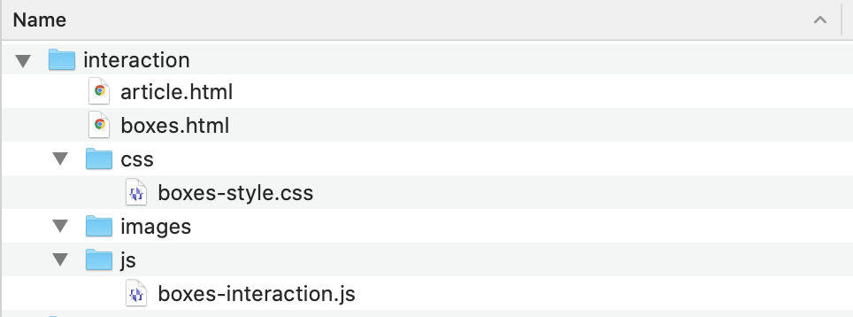
Last time we worked on JavaScript we left off with a folder that looked like this:
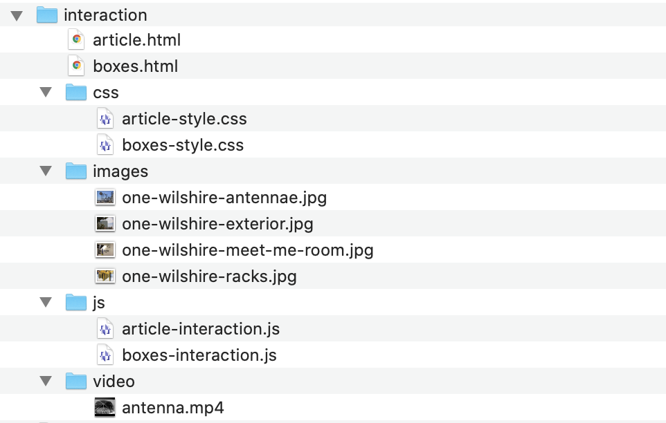
Today we're going to add some new files and by the end of the day you should have a working folder that looks like this:
To get started, download the following multimedia files, and save or move them into the right place:
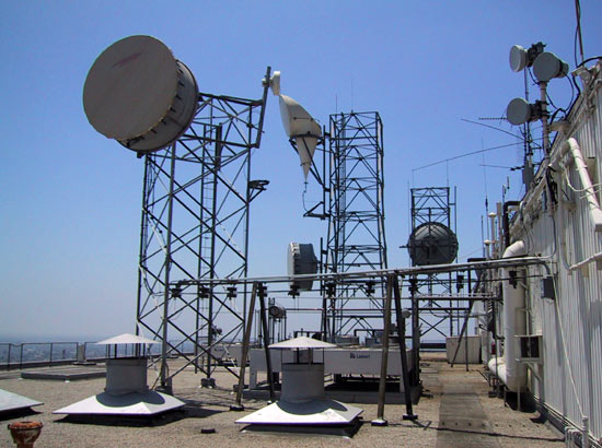
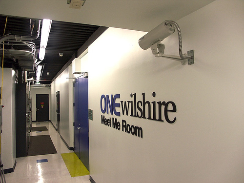
- one-wilshire-antennae.jpg
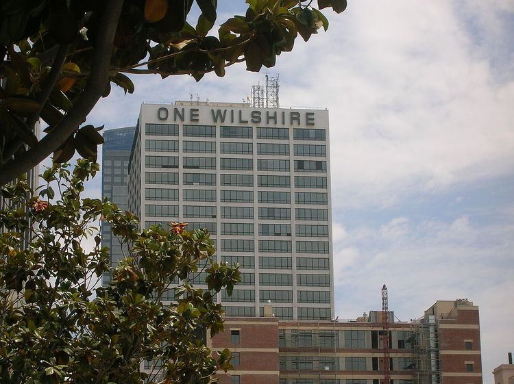
- one-wilshire-exterior.jpg
- one-wilshire-meet-me-room.jpg
- one-wilshire-racks.jpg
- antenna.mp4
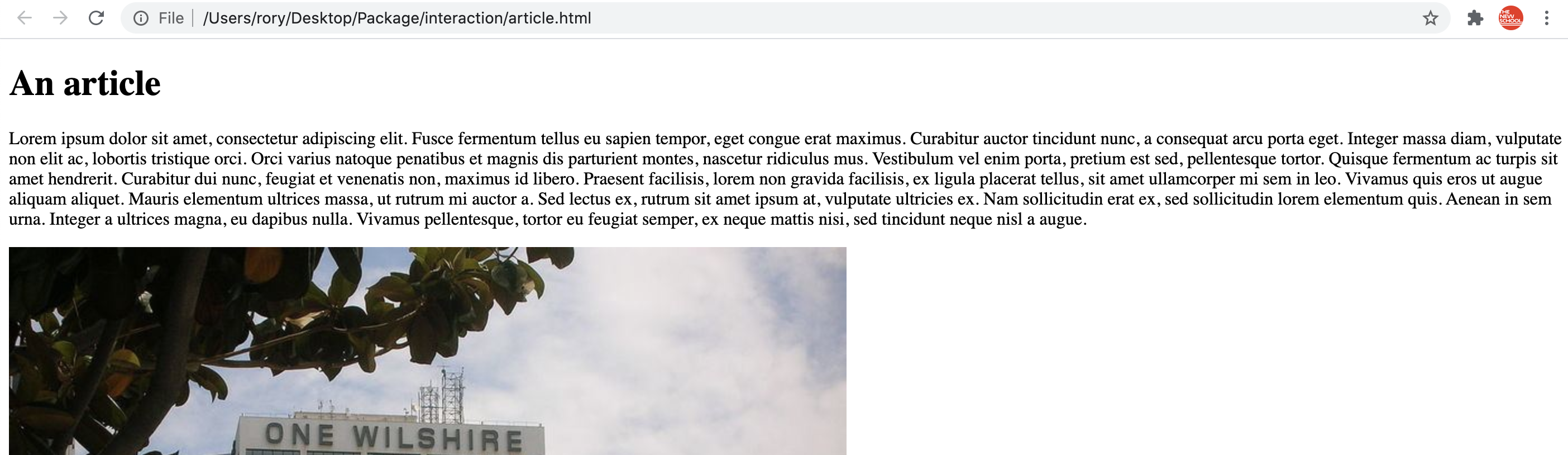
Next, let's make a new page that we can use to experiment with the new techniques for today. I've created a page that contains several paragraphs of lorem ipsum text with some images interspersed, which I hope will seem to you like a plausible page of text that you might be working with for your project.
Download this file and save it as article.html,
overwriting the article.html file you already have,
or, copy/paste the contents of this file into
your article.html, deleting all the contents first:
If you double-click on article.html right now, it
looks pretty basic in your browser:
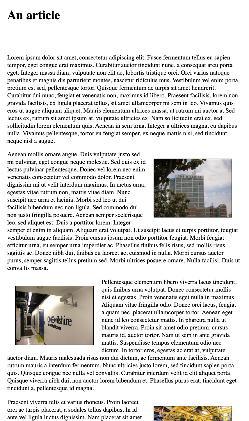
Let's get started by adding some CSS to clean up that layout a
bit. First, link this file to our CSS file. Add the following to
the <link> tag
inside <head>:
<link rel="stylesheet" href="css/article-style.css">
Let's look in that CSS file. Not too much there yet. Let's start
by adding some rules for styling the images. At the end of the
file after the .header {} rule, add
this:
.header {
  width: 100%;
  height: 100px;
}

img {
    width: 200px;
    border: solid 1px #000;
    margin: 20px;
}
img.left {
    float: left;
}
img.right {
    float: right;
}
Here I'm setting the width for all the images, adding a black
border, and some margin spacing around them. I'm also adding two
rules for images that I've classed
as left
and right, floating them appropriately.
Now your page should look like this:
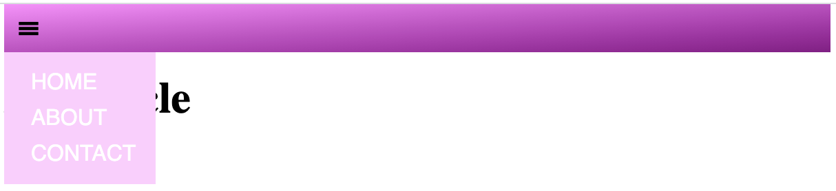
The infamous hamburger menu
Since there was a request for it in class, let's learn how to
use CSS and JavaScript to add the infamous three bar
"hamburger
icon"-style navigation menu
(≡) to
this page. It's really quite simple!
There are a few different ways you can approach this. One is to use a Unicode text character for the three bars icon. This is what we'll do here. I've adapted this from this really great article from The Intercept related to our class that you might enjoy: "White Supremacists, Conspiracy Theorists Are Targeting Cell Towers, Police Warn". If you're curious, you can right-click on their hamburger menu in the upper-left corner and click "inspect" to poke around and see how this is implemented.
To get started with this, let's first add the clickable icon in
a navigation menu area. Add the following HTML code
into article.html:
<body>

  <div class="main-navigation">
    <span class="hamburger-icon"></span>
    <nav>
      <a href="">Home</a>
      <a href="">About</a>
      <a href="">Contact</a>
    </nav>
  </div>

  <div class="header">
The
.main-navigation <div>
will extend across the width of the page, and be pinned to the
top of the window and the <span> is where
we'll put the hamburger icon. <nav> is rather
like a <div> tag: it does not do much
formatting on its own, but it has semantic significance, it
tells the browser that this is navigation text, which might help
text-to-speech readers or web crawlers or etc. To do anything
with this we have to style it. Add the following
into article-style.css:
.main-navigation {
    position: fixed;
    top: 0;
    width: 600px;
    height: 35px;
    background-color: #ff88ff;
    z-index: 10;
}
.hamburger-icon {
    display: block;
    font-size: 30px;
    line-height: 30px;
    margin: 0 0 0 10px;
}
.hamburger-icon:before {
    content: "\2261";
}
.main-navigation nav {
    background-color: #ffccff;
    width: 100px;
    margin-top: 5px;
    padding: 5px 0 5px 10px;
}
.main-navigation a {
    display: block;
    color: #ffffff;
    font-family: sans-serif;
    text-decoration: none;
    text-transform: uppercase;
    margin: 8px 0 8px 0;
    padding-left: 10px;
}
.main-navigation a:hover {
    text-decoration: underline;
}
You can put this anywhere that you like in the file, but I would
recommend in between lines 9 and 11, before
the .header rule.
There's a lot going on here. Most of it is basic styling stuff
to make this look nice: setting layout things like widths and
margins, background colors, etc. Probably the most
new/interesting is position:
fixed. This tells the browser to position this item in
relation to the browser window, meaning that as the user
scrolls, this item will not move. It is positioned in accordance
with the top property, which I've set
here to 0 meaning there are zero pixels
between the top of this item and the top of the browser window.
Also interesting
is .hamburger-icon:before. The colon is
used to indicate what is called
a pseudo-class. It is not a class specified by
you in HTML, but rather an implicit class that usually refers to
the state of the element. For example, you
could use :hoverto control display
properties when the user hovers over an element. In this case,
this style will insert content before the element(s)
being targeted
by .hamburger-icon. (You
can read more here.) The "\2261"
indicates a special character, in this case the Unicode
character code for ≡.
One other thing worth noting:
the .main-navigation a selector is a
new technique. This targets all <a> tags that
are inside any elements with
the .main-navigation class. In this
case it will target all the hyperlinks inside
the <nav> element, and it mainly is just
specifying layout and display properties.
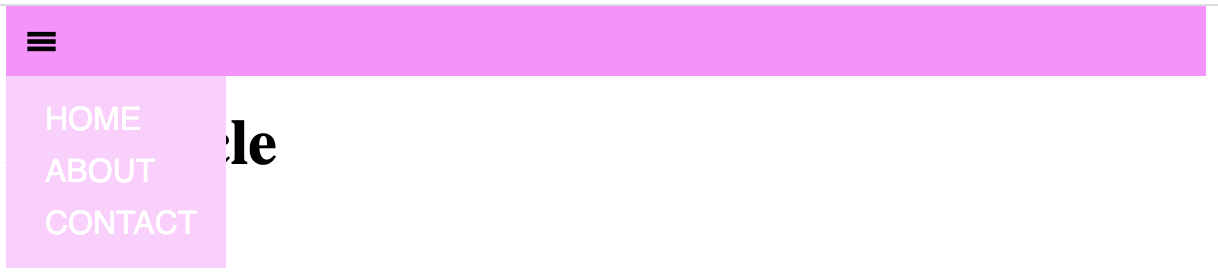
Your page should now have this element at the top, and it should stay fixed there no matter if you scroll the page down:
If you want to get a little fancier, try
modifying .main-navigation by deleting
or commenting out the background-color
rule, and below it add the following:
background-image: linear-gradient(to bottom right, #ff88ff, #880088);
Now your page should look like this:
Now that we have the clickable menu icon, and the actual menu
itself, let's hide it and only show it when the user clicks the
hamburger. First, to hide the menu, add the following property
to the .main-navigation nav rule:
display: none;
This will hide the menu by default. Now let's see how to display
it interactively using JavaScript.
First, to get started with jQuery on this page, we have to
include the jQuery library, like so: (add this inside
the <head> tag)
  <script src="https://code.jquery.com/jquery-3.6.0.js" integrity="sha256-H+K7U5CnXl1h5ywQfKtSj8PCmoN9aaq30gDh27Xc0jk=" crossorigin="anonymous"></script>
  <script src="js/article-interaction.js"></script>
(Make sure to copy/paste that whole thing. The
integrity attribute assures that the
file being included is the unaltered file from jquery.com, and
has not been intercepted and modified by a hacker. This is
important.)
Next, let's add our custom JavaScript file with our interaction rules. In Atom, create a new file and add the following boilerplate starting code for a jQuery file:
$(document).ready( function(){


});
And save this file in your js folder
as article-interaction.js
Now to add the actual interactive code. There are many ways you can do this. Probably the simplest is the following:
    $(".hamburger-icon").click(function(){
    	$(".main-navigation nav").toggle();
    });
This is saying: target any elements with
the hamburger-icon class, and for each one, add
a click event handler. This way,
whenever the user clicks on the icon it
will trigger this event handler, which then
will target any <nav> elements inside
a .main-navigation element, and for each of those,
toggle it's visibility. Thus, when the user clicks, if
the <nav> is hidden, it will be made visible,
and if the user clicks and it is already visible, it will be
hidden.
We could do the same thing but with fancier effects like sliding or fading, simply by changing that middle line:
    $(".hamburger-icon").click(function(){
        $(".main-navigation nav").slideToggle();
    });
or
    $(".hamburger-icon").click(function(){
        $(".main-navigation nav").fadeToggle();
    });
Each of those can also take a numeric argument which would
specify the amount of time in milliseconds for the effect to
last. For example:
    $(".hamburger-icon").click(function(){
        $(".main-navigation nav").fadeToggle(200);
    });
Now what if instead of the user clicking you wanted them just to hover the mouse over. You could implement that like this:
    $(".hamburger-icon").mouseenter(function(){
     	$(".main-navigation nav").show();
    });
The selectors and the event handler are the same, but the event
being handled is now mouseenter, which means when
the mouse moves over the element without needing to click.
This gets a little trickier because we can't use
the toggle functions, so instead we have to
implement a second event handler for when the mouse moves away
from the element:
    $(".main-navigation nav").mouseleave(function(){
    	$(".main-navigation nav").hide();
    });
Note that now the selector is indicating that
the mouseleave event is being handled when the
mouse moves away from the actual menu itself. This seems to me
to make the most sense as a user interface behavior, but you
could experiment with different methods yourself.
Emphasizing multimedia content
Let's move on to some techniques for highlighting or emphasizing multimedia content that you'd like the viewer to focus on, based on where they're at in the article in terms of their scrolling. What we'll do is gray out all the images, and then give them color to indicate focus or attention. Start by graying out all the images with the following rule:
img {
    width: 200px;
    border: solid 1px #000;
    margin: 20px;
    filter: grayscale(1);
}
Now let's add some JavaScript to handle scrolling events, and try to use some math to figure out which elements are in the middle of the window, which we'll consider "active." Probably easiest for me to include a chunk of code here and then explain:
    $(window).on("scroll", function() {
	var halfwayPoint = window.innerHeight / 2;

	$("img").each(function() {
	    var imgY = $(this).get(0).getBoundingClientRect().y;
	    if ( Math.abs(imgY - halfwayPoint) < 50 ) {
		$(this).css("filter","none");
	    } else {
		$(this).css("filter","grayscale(1)");
	    }
        });
    });
What this is doing first of all is adding an event handler that
is triggered whenever the window (specified in jQuery
as $(window)) is scrolled. Now inside this event
handler, first the halfway point of the window as measured in
pixels is calculated: window.innerHeight / 2 and
that number is saved for later use as halfwayPoint.
Next, for every <img> tag on the page
($("img").each(...) the jQuery
function .each() loops over every element that
matches that selector and applies the following code to it.
Inside that code, $(this) refers to the
"current" <img> element that matched. This is
almost like a for loop that iterates over a list,
and each time through, sets some variable to the next item in
the list.
So then $(this).get(0).getBoundingClientRect().y
accesses the current y position in pixels of
the <img> being looked at. imgY -
halfwayPoint is the difference between
the <img>'s y position as it is
scrolling and the middle point of the window. This value could
be positive or negative (if the image is above or below the
halfway point) so we take Math.abs() to always get a positive
value. Now, if that distance is less than 50 (which could be
above or below) then we turn off the
filter .css("filter","none"), otherwise we apply
grayscale with .css("filter","grayscale(1)"
Try this out and see what you get!
We can get a bit fancier. Have a look at this:
    $(window).on("scroll", function() {
        var halfwayPoint = window.innerHeight / 2;

	$("img").each(function() {
	    var imgY = $(this).get(0).getBoundingClientRect().y;
	    var distanceFromCenter = Math.abs(imgY - halfwayPoint);
	    if ( distanceFromCenter < 50 ) {
		var fadeFactor = distanceFromCenter/50;
		$(this).css("filter","grayscale("+fadeFactor+")");
	    } else {
		$(this).css("filter","grayscale(1)");
	    }
	});
    });
Here I'm calculating this variable fadeFactor
simply by dividing the distance by 50. The maximum value for
that distance is 50, and the minimum value is 0, so dividing by
50 is going to give me a value between 0 and 1. It turns out
that is precisely the range of values that the
CSS grayscale filter takes, so we can
pass that value in to that. Now as an image approaches the
middle of the window, it should have a quick fade to color
effect.
Triggering multimedia plays
As a last technique, let's look at how we can connect scrolling to triggering the play of a multimedia object like audio or video material.
First let's add a video object to the page. I'll replace the
second image, named one-wilshire-meet-me-room.jpg
with a >video> tag:
      <video class="left">
	<source src="video/antenna.mp4" type="video/mp4">
	  Your browser does not support the video element.
      </video>
We could specify this as autoplay, using
that attribute in the <video> tag itself, but
let's leave that off and triffer it by scrolling. We do that by
adding another scroll event handler, with some
changes:
    $(window).on("scroll", function() {
	var halfwayPoint = window.innerHeight / 2;

	$("video").each(function() {
	    var videoY = $(this).get(0).getBoundingClientRect().y;
	    var distanceFromCenter = Math.abs(videoY - halfwayPoint);
	    if ( distanceFromCenter < 50 ) {
		$(this).trigger("play");
	    }
	});
    });
This time we're calling .each() on all
the video elements. And for each one we are again
getting the y position in pixels of the video
element: $(this).get(0).getBoundingClientRect().y;,
and we are again calculating the distance between this element
and the middle of the window. But this time, if that distance is
less than 50, we're triggering the video to
play: $(this).trigger("play").
Try this and see what happens. If you're using Chrome it won't
work. Why? Open up the console and try again. You might need to
reload. The error message I got included a URL point
to this
help page. That explained that Google Chrome now disables
autoplay unless the user first interacts somehow with the
window, and apparently just scrolling does not count as an
interaction. They do however allow autoplay if the
video is muted. So let's add the muted attribute to
our <video> tag:
<video class="left" muted>
Now I believe it should work!!
Concluding
We have been working on three files during the course of this lesson. I hope you take the time to work through the instructions and discussion above step-by-step to try to code these files yourself. If you would like to see how the resulting three files should probably look after doing all these exercises, you can find them all here: